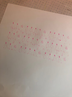
With my self initiated brief, I wanted to push myself and my skills further, with wanting to create more physical products this year. I chose to use the method of screen printing with liking the aesthetic that it creates. Within the J card design, this means that I have to screen print two different sides, or more if I want more layers. Within the designs I created both a pattern and the stand alone illustration to test the difference of the design application to the screen print. Within screen printed I experimented with different background colours that relate to Swedish schlager. With printing both the pattern and the design It was seen that the pattern due to being smaller lines, didn't expose properly meaning the ink dissent transfer through properly. From the experimentation of different colours it was apparent that the pink illustrations elevated against the light blue stock. With the main colours of the genre lighting, staging and costumes being pink, purple and blue, I decided that light blue was the best outcome for the design. Due to the print changing with each press, I made quite a few due to the ink coming out differently each time, so I had variation for the final outcome and to account of any errors with the folding and cutting process. Although I really like the final outcome, I don't think I will continue this process after my degree due to the little aspects such as having to clean the screen that follow the lengthy process.


No comments:
Post a Comment