Me and Emily decided that we would like extra imagery to support the packaging design, to which will reflect our concept even further. We had communication with Ellen and we all agreed that having an illustration of a woman with her mood changing would be a great element to incorporate, with the flame also still being a prominent feature. The illustration would further resemble the burning of the effigy which are range and concept is inspired by.
Tuesday, 31 March 2020
Monday, 30 March 2020
Oliver Bonas: Design development
With playing around with the flame layout and different text layout, I then constructed the nets to see how the flame would look from the front to make sure that the imagery is eye catching and appeals to the Oliver Bonas audience, Emily then further experimented with type with us both agreeing that we needed to find a more appropriate typeface.
Sunday, 29 March 2020
Oliver Bonas: Design develop
With the use of aztec symbolism, I tested how this subtle imagery would work within Ellen's pattern and the net.
Friday, 27 March 2020
Lockdown changes
With the current unprecedented time it means that a lot of way of working and brief outcomes will have to adapt and change as a result. With the week before the 23rd there was deliberation on what will happen so I had to change my timeline of two briefs over in order to focus on screen printing due to needing the resources. This mean that we had to put back the Oliver bonas brief and meant as an external and internal collab it is harder to communicate. It also means that the research brief will have to most likely be mockup outcomes due to wanting to focus on a branding collateral. It also means that all my photoshoots that I had planned can no longer be done, especially the UK greetings photoshoot idea which I really wanted to do! With last week already being disruptive I can sense that it will be so hard to concentrate epically with having to refigure briefs, however I will try my hardest to stick to the original time plan.
Thursday, 26 March 2020
Something More studio further inspiration
At the beginning of the year (oct 2019) Something More studio came in to set a live brief to be completed by the end of the week. The brief was to create an engaging presentation based on the mundane word given. The word that our group was given was Potato, from ideation within the group we decided to create personalties and characteristics out of different types of fries, which lead to the presentation on the Friday. Due to Myself and Emily being inspired by the studio and the concept of creating something engaging from a common word, we decided to develop the brief set. We created Find a Fry snap, which is a fun engaging family card game. We promoted this brief on our social media platforms and tagged the studio so they could see how we were inspired by their initial ask.
Tuesday, 24 March 2020
Development of branding elements
With having the final logo acquired for the re brand of ikldesign, the first branding element to design and to change was the business card. Within my old branding, I didn't make a business card as the brand was solely for social media and Easy, so all I required was a thank you card for orders. However, with becoming a professional designer, it seemed impressive to finally get a business card that can represent me well. My first idea was to have the card be a mini portfolio, with liking the idea of using some of my favourite designs/pattern as the reverse to my information. This way, the recipient would be more inclined to keep my business card and therefore have a look at my socials or work. The problem with this however is that the pink back with the info might not be coherent depending on the artwork chosen, so I developed the idea with just having a white back with the pink branding colour as the border. I loved my artwork being distributed, with this being a good way to represent myself and my type of projects as a designer but with feedback, peers stated that they would actually prefer a more minimalist approach. I stripped back the concept and instead had my logo as the imagery, which is simple yet does the job. To find a balance between the project imagery and logo I then decided to tweak the brand supporting imagery of the smile and added a speech bubble. This imagery represents myself well with further displaying the fun, friendly and approachable aspect of my design and myself as a designer. From the options I Decided to take the hello idea with it being harmonious with my other branding, engaging, fun and a design that will be remembered.
Friday, 20 March 2020
Screen printing - Self initiated brief
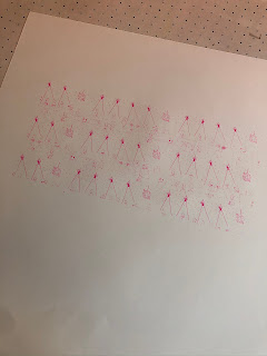
With my self initiated brief, I wanted to push myself and my skills further, with wanting to create more physical products this year. I chose to use the method of screen printing with liking the aesthetic that it creates. Within the J card design, this means that I have to screen print two different sides, or more if I want more layers. Within the designs I created both a pattern and the stand alone illustration to test the difference of the design application to the screen print. Within screen printed I experimented with different background colours that relate to Swedish schlager. With printing both the pattern and the design It was seen that the pattern due to being smaller lines, didn't expose properly meaning the ink dissent transfer through properly. From the experimentation of different colours it was apparent that the pink illustrations elevated against the light blue stock. With the main colours of the genre lighting, staging and costumes being pink, purple and blue, I decided that light blue was the best outcome for the design. Due to the print changing with each press, I made quite a few due to the ink coming out differently each time, so I had variation for the final outcome and to account of any errors with the folding and cutting process. Although I really like the final outcome, I don't think I will continue this process after my degree due to the little aspects such as having to clean the screen that follow the lengthy process.
Tuesday, 17 March 2020
Website developments - masthead gif
With the current theme that my website has I wasn't 100% happy with the layout and use of 'hi, I'm Izzy Latimer' due to this being an overseen element and doesn't go with my branding. To tackle this element, I experimented with the layout. I first put a picture of one of my projects as a masthead as an underlay to see wether it would be coherent with seeing all the other projects, however I still didn't like the look of the website greeting. I decided to scrap the greeting due to it not fitting in with my branding and to further develop my current branding elements I created a gif. I decided that I wanted a break between entering my website and having a look at my projects and having a gif that related to myself and my branding. The gif I created uses the 'smiley faces' which people know me for and also adheres to my mantra of creating positive and light hearted design.
the gif;
Monday, 16 March 2020
Visiting profesional - Darren Armstrong (UX)
Freelance UX Designer
started off as a junior web designer - web designer - senior interaction designer - senior ux designer to freelance lead ux
UX - how products are used by people
a person's interaction/experience, how straightforward is the experience easy, smooth? can cover everything from online shopping to an app
ux research - interview, survey, testing, analysis, wireframes & prototypes - user journey
out of uni he was in jobs then built portfolio in that time which then got him into his first ux role
good portfolio, persistence, work experience, network, have hobbies and side projects
enjoy what you do - find it fulfilling
went from in house to contract base when had enough experience and was bored of the lengthy in house projects - put his cv on job boards - his current contracts are around 6 months and face design problems prodominately
Friday, 13 March 2020
Oliver Bonas: Meeting With Ellen after research
With myself and Emily researching into the project pack and the in depth to the collection and its routes, we liked the idea of basing our candle range on the Veracruz carnival. We found out that the collection was inspired by Mexico and the Veracruz is the most popular carnival, that features vibrant colour and pattern throughout. We met up with Ellen to discuss the routes that we could take to designing the packaging for the candles. Ellen liked the idea of touching upon Mexican culture more, with her own practice being heavily inspired by Mexican floral surface patterns. We all discussed how we wanted to have an array of directions, with the imagery of a carnival being visually heavy, so we need to find a direction to narrow it down and be more restrictive. Ellen was happy with the approach and stated that she would have an array of ideas in around a weeks time and she would look further into the project pack for inspiration when designing the Mexican inspired patterns to make sure the Vision represent Oliver Bonas well.
Wednesday, 11 March 2020
Oliver Bonas external collab - Mexican key to happiness
The Mexican recipe to happiness includes a large dose of social contact. Lots of social bonding, talking, laughing, and joking takes places around here. Families eat together Sundays or Saturdays, and these meals include grandparents— usually the hosts — sons, daughters, in-laws, grandchildren, cousins, etc. This happens once a week. Friends at work eat together almost every day, and friends usually have a specific day of the week booked to spend time together. Anything is an excuse for people to get together to watch soccer, football, to prepare BBQ with family and/friends. There is music, and beer, lots of jokes.
God is an important ingredient to Mexican happiness. There is a good chunk of the population who likes to leave stuff in the hands of God. Yes they worry, yes they suffer but eventually they say something like “God has a reason,” “in God I trust,” “it’s God’s will,” “God is with me.” I believe this shortens the impact of difficulties and anxiety.
(bluezones.com)
what can we learn from happy Mexicans;
Spend less time alone.
Grow your circle of friends — happiness gets amplified when surrounded by people.
Laugh more.
Find happiness in the little things .
Stop glorifying being busy all the time.
Be humble.
Grow your circle of friends — happiness gets amplified when surrounded by people.
Laugh more.
Find happiness in the little things .
Stop glorifying being busy all the time.
Be humble.
Tuesday, 10 March 2020
oliver bonas external collab - research
Oliver Bonas research
ss20 tierra -The name Tierra means Earth/Land and is of Spanish origin.
tierra blanca - city in Mexico
about, colour, type
We are inspired by the alchemy of great design and fresh thinking and the belief that design has the power to positively affect how we feel.
natures relaxing - earth, endorphins
key words:
health, wellbeing, relaxing, mind, soul, tranquility, warm minimalism
daijo-bu - its ok, it will be ok
In Japan, shinrin-yoku, or “forest bathing,” is a preventative health care method based upon the belief that there are health benefits that can come from living in the forest. This is based on the belief that spending time outside can reduce stress, boost your mood and help your immune system function at its peak.
warm minimalism - This so-called warm minimalism has caught our eye in a big way, combining the less-is-more ethos with sumptuous designs: Substantially scaled pieces, rich materials, natural hues, and lots of lush textures and details anchor airy, often-white rooms.
Elevation is a major climatic influence in most parts of Mexico, and several vertical climatic zones are recognized. From sea level to just over 3,000 feet (900 metres) is the tierra caliente (“hot land”), with uniformly high temperatures. For example, Veracruz, located on the Gulf of Mexico, has an average daily temperature of approximately 77 °F (25 °C). The tierra templada (“temperate land”) extends to about 6,000 feet (1,800 metres) and includes the city of Xalapa, at an elevation of more than 4,600 feet (1,400 metres), where the average daily temperature is 66 °F (19 °C). The tierra fría (“cold land”) extends as high as 11,000 feet (3,350 metres) and includes Pachuca, at just under 8,000 feet (2,440 metres), where the average annual temperature is 59 °F (15 °C). Above the tierra fría are the páramos, or alpine pastures, and the tierra helada (“frozen land”), or permanent snow line, which is found at 13,000–14,000 feet (4,000–4,270 metres) in central Mexico.
inspired by their trip to Mexico - a carnival named Veracruz's carnival, they have a ritual at the start called 'burn of the bad mood' which they set free to anything that causes a bad mood.
ss20 tierra -The name Tierra means Earth/Land and is of Spanish origin.
tierra blanca - city in Mexico
about, colour, type
We are inspired by the alchemy of great design and fresh thinking and the belief that design has the power to positively affect how we feel.
natures relaxing - earth, endorphins
key words:
health, wellbeing, relaxing, mind, soul, tranquility, warm minimalism
daijo-bu - its ok, it will be ok
In Japan, shinrin-yoku, or “forest bathing,” is a preventative health care method based upon the belief that there are health benefits that can come from living in the forest. This is based on the belief that spending time outside can reduce stress, boost your mood and help your immune system function at its peak.
warm minimalism - This so-called warm minimalism has caught our eye in a big way, combining the less-is-more ethos with sumptuous designs: Substantially scaled pieces, rich materials, natural hues, and lots of lush textures and details anchor airy, often-white rooms.
These lovely little natural, sand finished pots are filled with your favourite St. Eval scents. Rustic and earthy with soft, natural tones, to perfectly complement the home. Inspired by the peaceful, grounding and balancing elements of earth and sky.
tom Dixon
A series of fragrances inspired by the medieval alchemist and eastern philosopher’s quest to reduce all matter to four simple elements; four scents of extreme simplicity and individual character that reflect their elemental names of Fire, Air, Earth and Water.
inspired by their trip to Mexico - a carnival named Veracruz's carnival, they have a ritual at the start called 'burn of the bad mood' which they set free to anything that causes a bad mood.
Burning of the Bad Mood (Quema del Mal Humor) – Mexico
In Mexico, Carnival kicks off with a beloved tradition: the Quema del Mal Humor, or Burning of the Bad Mood. The ritual begins with a larger-than-life effigy of a disliked political figure or celebrity – picture a huge, cartoonish piñata – suspended over the crowds. Then the papier-mâché puppet is set on fire, and carnival-goers cheer and celebrate as it goes up in flames. The tradition is symbolic: as the piñata burns, it’s a cue for people to let go of their everyday worries and enjoy the start of the festivities. (lonelyPlanet.com)
- Veracruz Carnaval, like many of its fellow Latin American Carnavals, has merged church, state and the collective will of the people into unique annual traditions that preserve the past while looking forward to the future.
- The parades feature hundreds of beautiful, scantily clad women shaking to Latin dance rhythms on some pretty large floats featuring beer and soda company props. Jarochos create these fantastic floats, known as carros alegóricos or allegorical cars, with true Mexican flair using bright colors, papier mâché figures, large flowers, and live entertainment.
- While the floats in the parades don’t change that much, a Carnavelgoer needs to experience at least one of the four spectacular night parades where the water, lights, rhythms and interaction between the crowd and dancers gives back as much energy as a visitor wants to put into the potent mix.
- Dance groups from nearby villages don their peacock and pheasant-feathered headdresses in preparation for the dances they’ll perform during the festivities.
- The next days, you'll get to see the crowning of the Carnival Queen, King of Happiness, and Child Kings. Over seven days, the streets are filled with colorful masked parades, dance performances, floats, local food vendors, and concerts along Manuel Avila Camacho Boulevard. The carnival ends with the burial of Juan Carnaval, which is another puppet representing the week full of fiesta and unparalleled excess. crowning of carnival kings and the burial of “Juan Carnaval”
- Music plays a very important role in Veracruz’s celebrations and a variety of different styles can be heard whether it’s danzon in the main plaza, marimba during one of their many parades or ballads during their ‘burning of the bad mood’ ritual.
Monday, 9 March 2020
Self initiated brief (cassette) - Sweden primary research
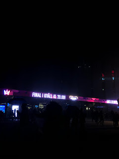
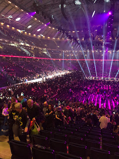
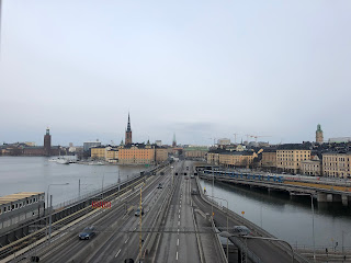
This weekend I visited Stockholm in Sweden and went to the final of Melodifestivalen, which is the main event that Swedish schlager is associated with. In the event 11 songs compete to win the show to then go on and represent Sweden at Eurovision. From walking to Friends arena In Stockholm it was clear how big this festival is to Swedish people, with shops advertising it, food places serving melodifestivalen cake and many people wearing glitter hats, carrying signs and wearing glitter and sequins. When entering the arena it is clear how many people watch and are interested in the genre and the new culture within Sweden. The mall next door was also having a week of competitions, celebrations and events to celebrate the final week. From going first hand to the show I was able to see the array of colours and props and costumes as well as absorbing the atmosphere which really helped to create a more clear and representative view for the cassette. The primary research has enabled me to develop and refine the initial ideas and design to become the best representation of the genre. From going, it is apparent that the main colours I should include is pink, purple and blue, with the lights often using these hues within the venue and performances. Also, in modern day the show is less 'tacky' and more modern, yet still has the element of glitter and sequins so I should take this into account.
Subscribe to:
Comments (Atom)


